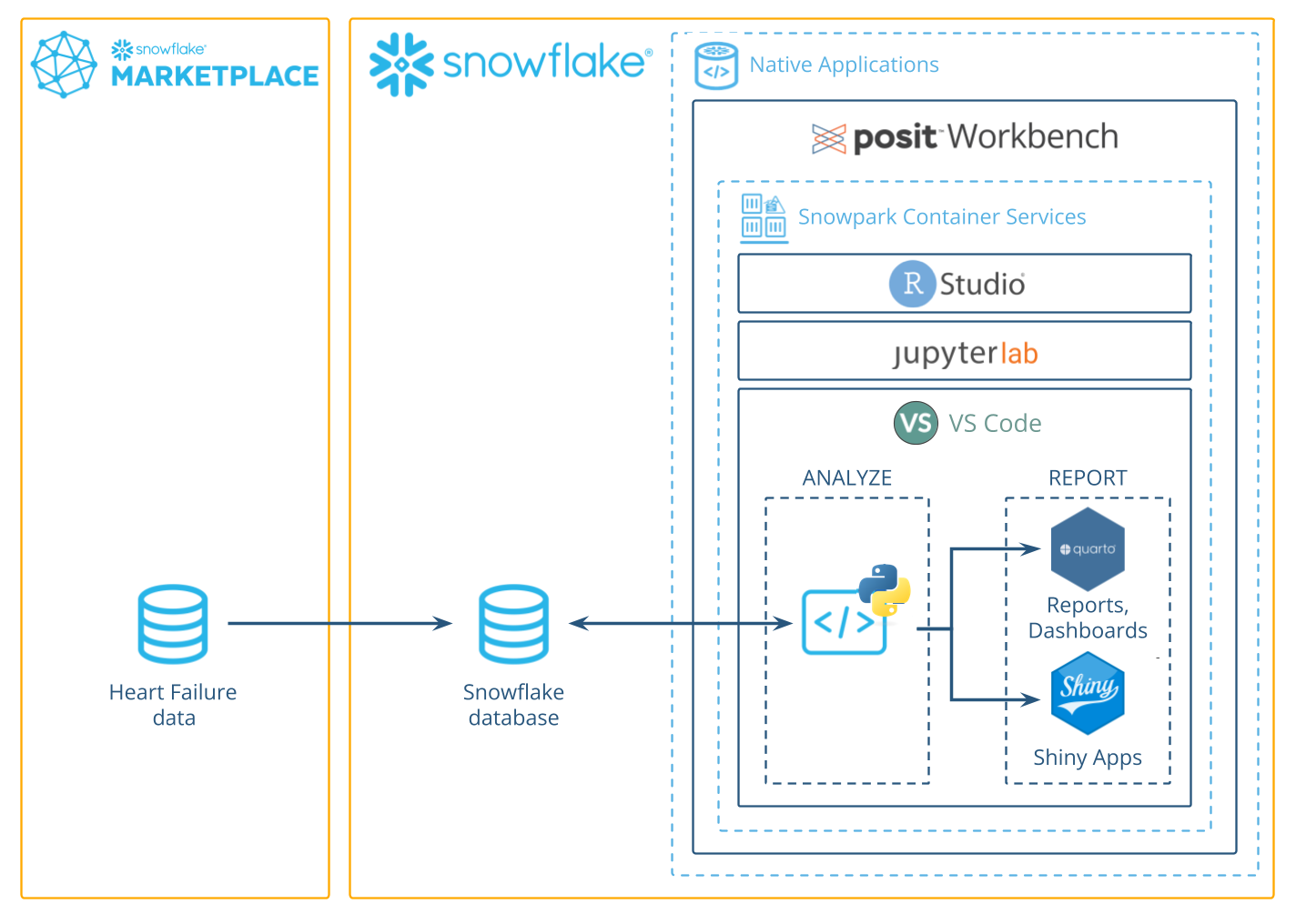
In this guide, we'll use Python to analyze data in Snowflake using the Posit Workbench Native App. You'll learn how to launch the Posit Workbench Native App and use the available VS Code IDE. You'll also learn how to use the Ibis library to translate Python code into SQL, allowing you to run data operations directly in Snowflake's high-performance computing environment.
We'll focus on a healthcare example by analyzing heart failure data. We'll guide you through accessing the data and performing data cleaning, transformation, and visualization. Finally, you'll see how to generate an HTML report, build an interactive Shiny app, and write data back to Snowflake—completing an end-to-end analysis in Python entirely within Snowflake.
What You Will Learn
- How to work in VS Code from Posit Workbench Native App.
- How to connect to your Snowflake data from Python to create tables, visualizations, and more.
What You Will Build
- A VS Code environment to use within Snowflake.
- A Quarto document that contains plots and tables built with Python, using data stored in Snowflake.
- An interactive Shiny for Python application built using data stored in Snowflake.
Along the way, you will use Python to analyze which variables are associated with survival among patients with heart failure. You can follow along with this quickstart guide, or look at the materials provided in the accompanying repository: https://github.com/posit-dev/snowflake-posit-quickstart-python.
Prerequisites
- A Snowflake account with appropriate access to databases and schemas.
- A Posit Workbench license and the ability to launch Posit Workbench from Snowflake Native Applications. This can be provided by an administrator with the
accountadminrole. - Familiarity with Python.
Before we begin, let's set up a few components. We need to:
- Add the heart failure data to Snowflake
- Launch the Posit Workbench Native App
- Create a VS Code session
- Create a virtual environment and install the necessary libraries
Create a warehouse, database, and schema
For this analysis, we'll use the Heart Failure Clinical Records dataset. First, we need to create a warehouse, database, and schema.
In Snowsight, open a SQL worksheet (Create > SQL Worksheet). Then, paste in and run the following code, which creates the necessary database, schema, and warehouse. Make sure to change the role to your own role.
USE ROLE myrole; -- Replace with your actual Snowflake role (e.g., sysadmin)

CREATE OR REPLACE DATABASE HEART_FAILURE;

CREATE OR REPLACE SCHEMA PUBLIC;

CREATE OR REPLACE WAREHOUSE HF_WH
    WAREHOUSE_SIZE = 'xsmall'
    WAREHOUSE_TYPE = 'standard'
    AUTO_SUSPEND = 60
    AUTO_RESUME = TRUE
    INITIALLY_SUSPENDED = TRUE;
This creates a database named HEART_FAILURE with a schema PUBLIC, as well as a warehouse named HF_WH.
Load data into Snowflake
Next, we need to create a table to hold the heart failure dataset.
- Download the dataset from UCI:https://archive.ics.uci.edu/ml/datasets/Heart+failure+clinical+records
- Unzip the downloaded file. You should now see a file named
heart_failure_clinical_records_dataset.csv. We'll upload this CSV into Snowflake using the Snowsight UI. - In Snowsight, click
Create > Add Data, then selectLoad Data into a Table. - Click
Browseand chooseheart_failure_clinical_records_dataset.csv. - Under Select or create a database and schema, choose:
- Database:
HEART_FAILURE - Schema:
PUBLIC
- Database:
- Under Select or create a table:
- Ensure + Create new table is selected.
- For Name, enter
HEART_FAILURE.
- Click
Next, thenLoad.
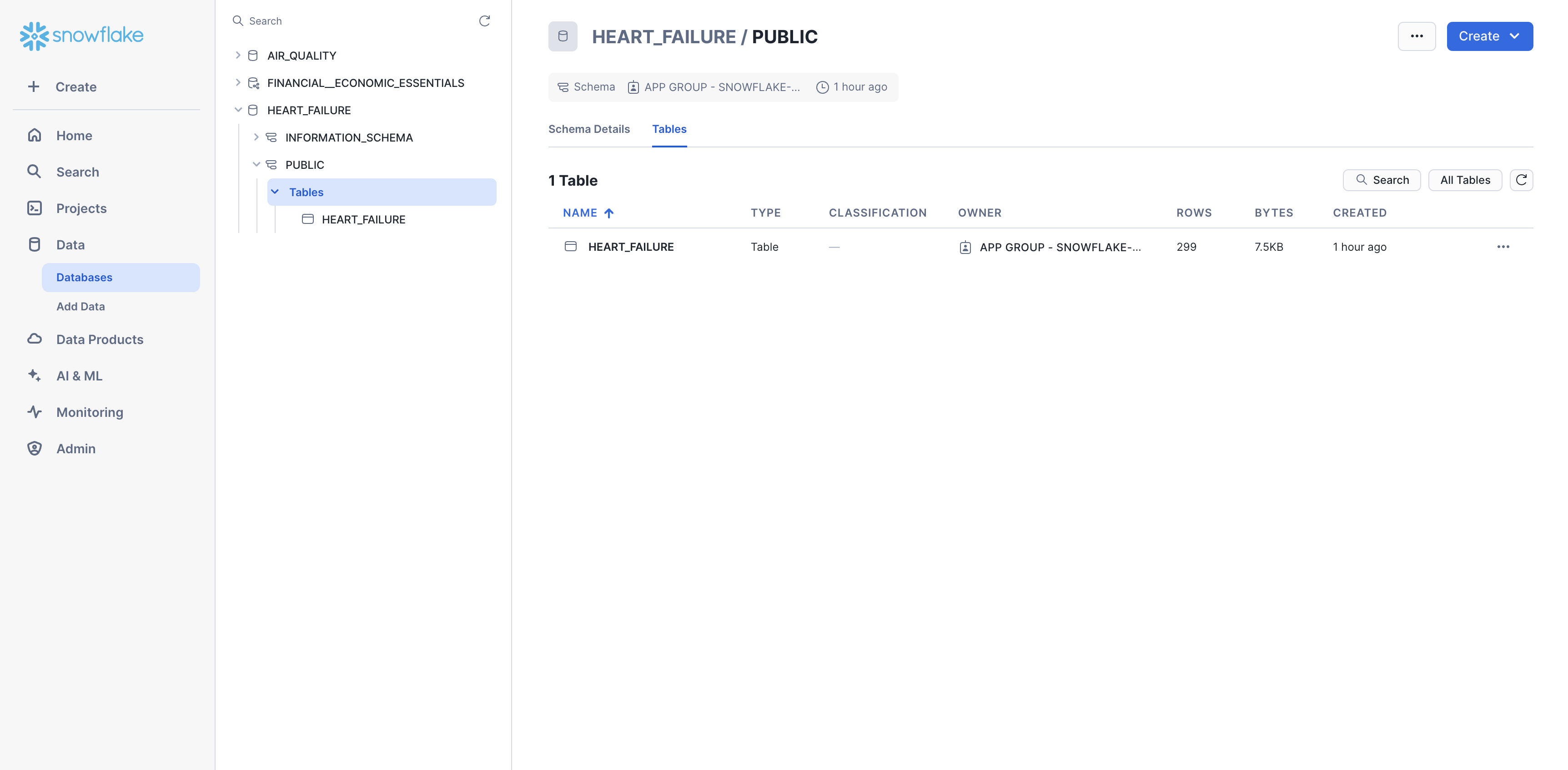
Confirm the database, data, and schema
You should now be able to see the heart failure data in Snowsight. Navigate to Data > Databases > HEART_FAILURE > PUBLIC > Tables. You should now see the HEART_FAILURE table.
Launch Posit Workbench
We can now start exploring the data using Posit Workbench. You can find Posit Workbench as a Snowflake Native Application and use it to connect to your database.
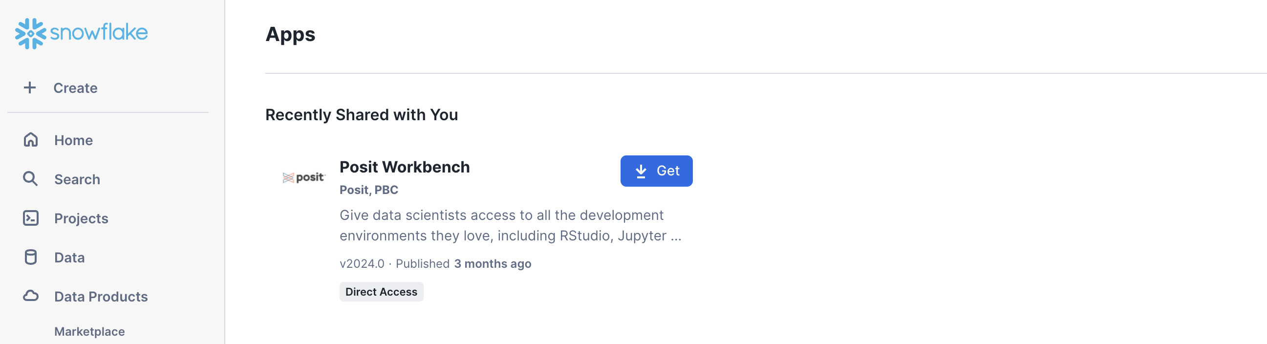
Step 1: Navigate to Apps
In your Snowflake account, go to Data Products > Apps to open the Native Apps collection. If Posit Workbench is not already installed, click Get. Please note that the Native App must be installed and configured by an administrator.
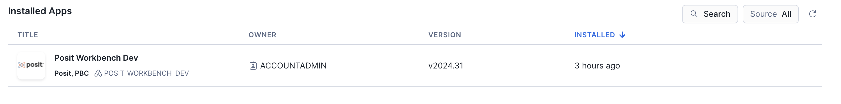
Step 2: Open the Posit Workbench Native App
Once Posit Workbench is installed, click on the app under Installed Apps to launch the app. If you do not see the Posit Workbench app listed, ask your Snowflake account administrator for access to the app.
After clicking on the app, you will see a page with configuration instructions and a blue Launch app button.
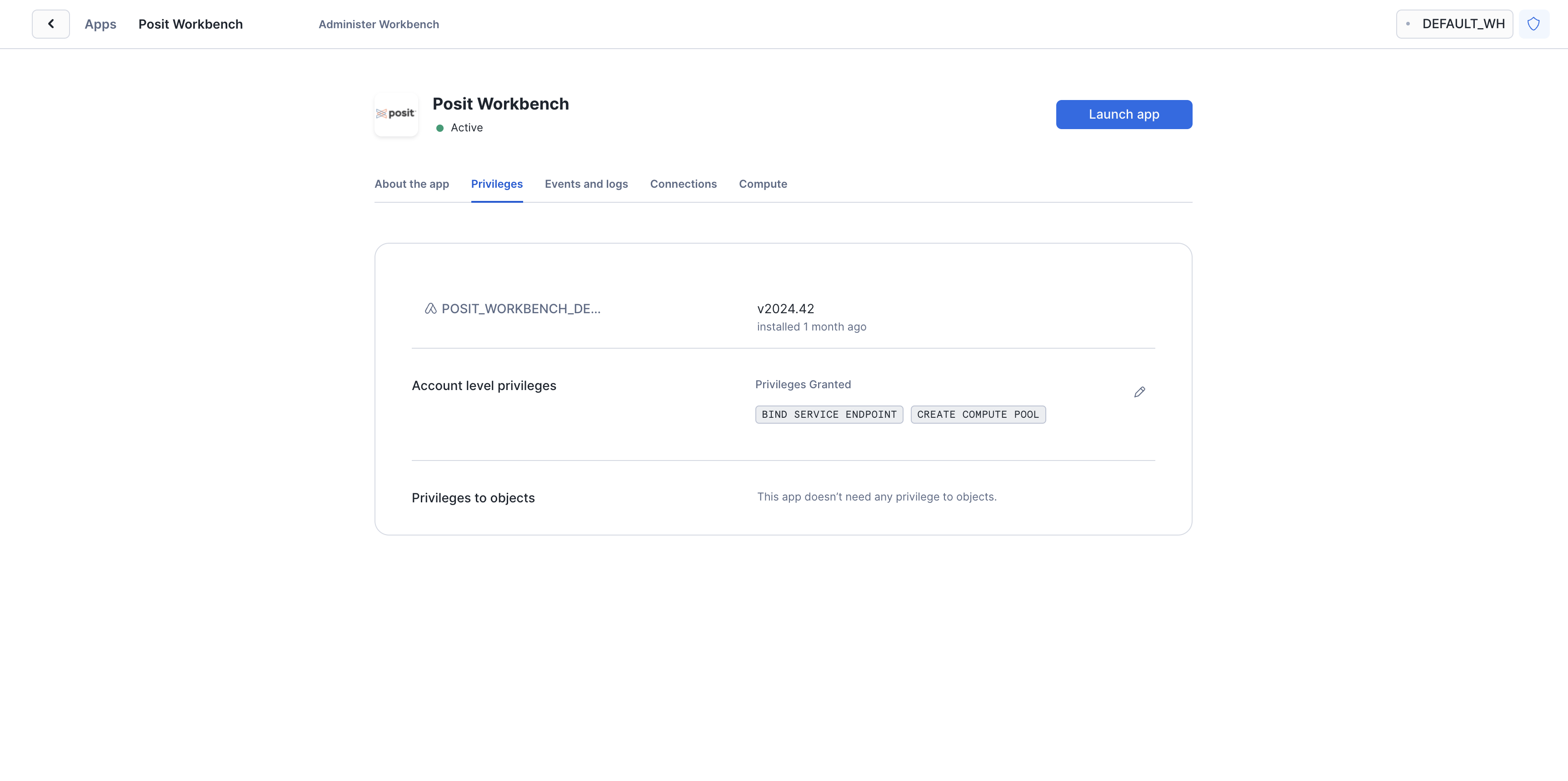
Click on Launch app. This should take you to the webpage generated for the Workbench application. You may be prompted to first login to Snowflake using your regular credentials or authentication method.
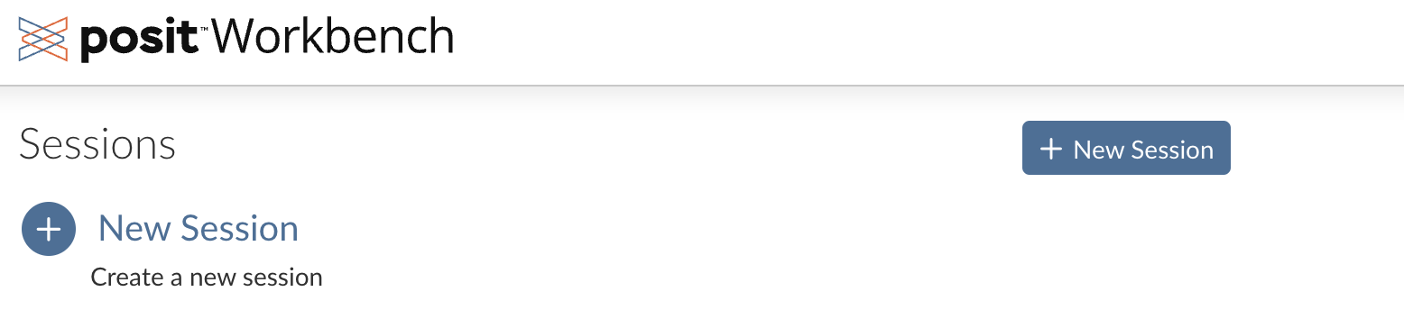
Create a VS Code Session
Posit Workbench provides several IDEs, including VS Code, RStudio Pro, and JupyterLab. For this analysis, we will use VS Code.
Step 1: New Session
Within Posit Workbench, click New Session to launch a new session.
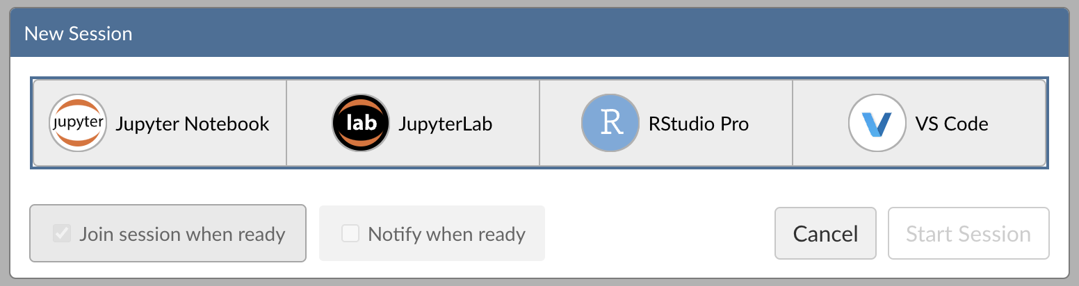
Step 2: Select an IDE
When prompted, select VS Code.
Step 3: Log into your Snowflake account
Next, connect to your Snowflake account from within Posit Workbench. Under Session Credentials, click the button with the Snowflake icon to sign in to Snowflake. Follow the sign in prompts.
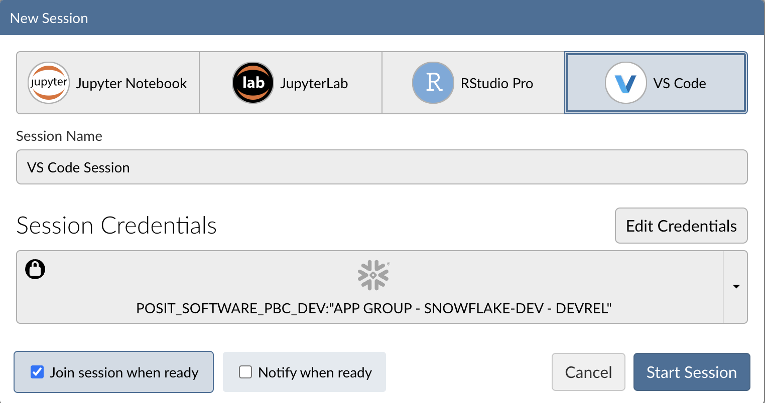
When you're successfully signed in to Snowflake, the Snowflake button will turn blue and there will be a check mark in the upper-left corner.
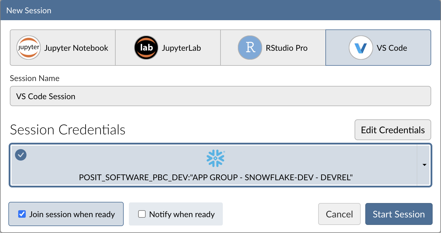
Step 4: Launch VS Code
Click Start Session to launch VS Code.
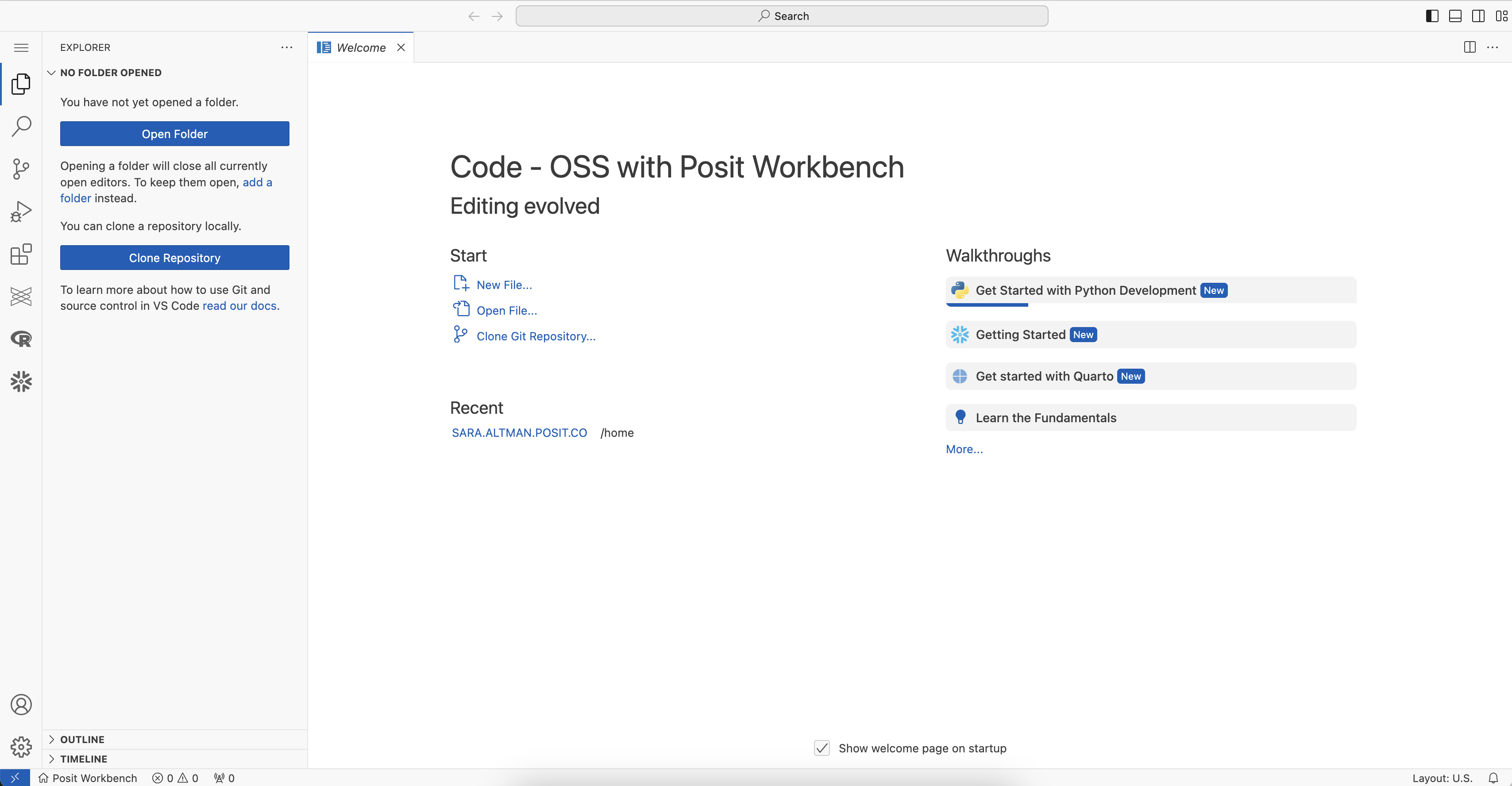
You will now be able to work with your Snowflake data in VS Code. Since the IDE is provided by the Posit Workbench Native App, your entire analysis will occur securely within Snowflake.
Install Quarto, Shiny, and Jupyter Extensions
The Quarto and Shiny VS Code Extensions support the development of Quarto documents and Shiny apps in VS Code. The Jupyter extension provides support for running Python code in notebook cells
Install these extensions:
- Open the VS Code Extensions view. On the right-hand side of VS Code, click the Extensions icon in the Activity bar to open the Extensions view.
- Search for "Quarto" to find the Quarto extension.
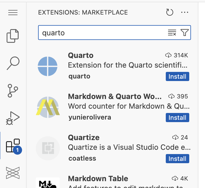
- Install the Quarto extension. Click on the Quarto extension, then click
Install. - Install the Shiny extension. Search for the Shiny extension, then install the extension in the same way.
- Install the Jupyter extension. Search for the Jupyter extension, then install the extension in the same way.
You can learn more about these extensions here: Shiny extension, Quarto extension.
Open a new folder
- Launch "Open Folder": Press
Ctrl/Cmd+Shift+Pto open the Command Palette, type File: Open Folder, and press Enter. In the dialog that appears, navigate to the directory where you want your work to live and click Ok. - Create a subfolder: In the Explorer pane (left sidebar), click the New Folder button (the folder icon) and name the folder
heart_failure. - Switch into the new folder: Press
Ctrl/Cmd+Shift+Pagain to reopen the Command Palette, select File: Open Folder, then navigate toheart_failureand click Ok. - You now have an empty
heart_failurefolder open and ready for your work.
Create a virtual environment
- Open the Command Palette (
Cmd/Ctrl+Shift+P), then search for and select Python: Create Environment. - Choose
Venvto create a.venvvirtual environment. - Select the Python version you want to use.
- In a terminal, activate the virtual environment by running
source .venv/bin/activate.
Access the Quickstart Materials
This Quickstart will walk you through the analysis contained in https://github.com/posit-dev/snowflake-posit-quickstart-python/blob/main/quarto.qmd. To follow along, you can clone the GitHub repo:
git clone https://github.com/posit-dev/snowflake-posit-quickstart-python/
Install requirements
In a terminal, run the following command to install the dependencies listed in requirements.txt:
pip install -r requirements.txt
Note: Make sure your virtual environment is activated (source .venv/bin/activate) before installing.
Before we dive into the specifics of the code, let's first discuss Quarto. We've written our analysis in a Quarto (.qmd) document, quarto.qmd. Quarto is an open-source publishing system that makes it easy to create data products such as documents, presentations, dashboards, websites, and books.
By placing our work in a Quarto document, we've interwoven all of our code, results, output, and prose text into a single literate programming document. This way everything can travel together in a reproducible data product.
A Quarto document can be thought of as a regular markdown document, but with the ability to run code chunks.
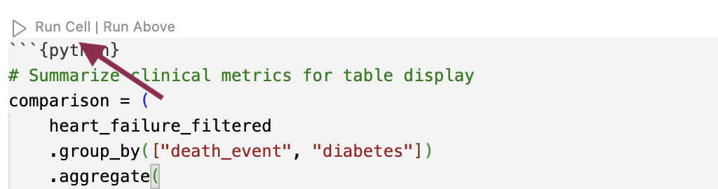
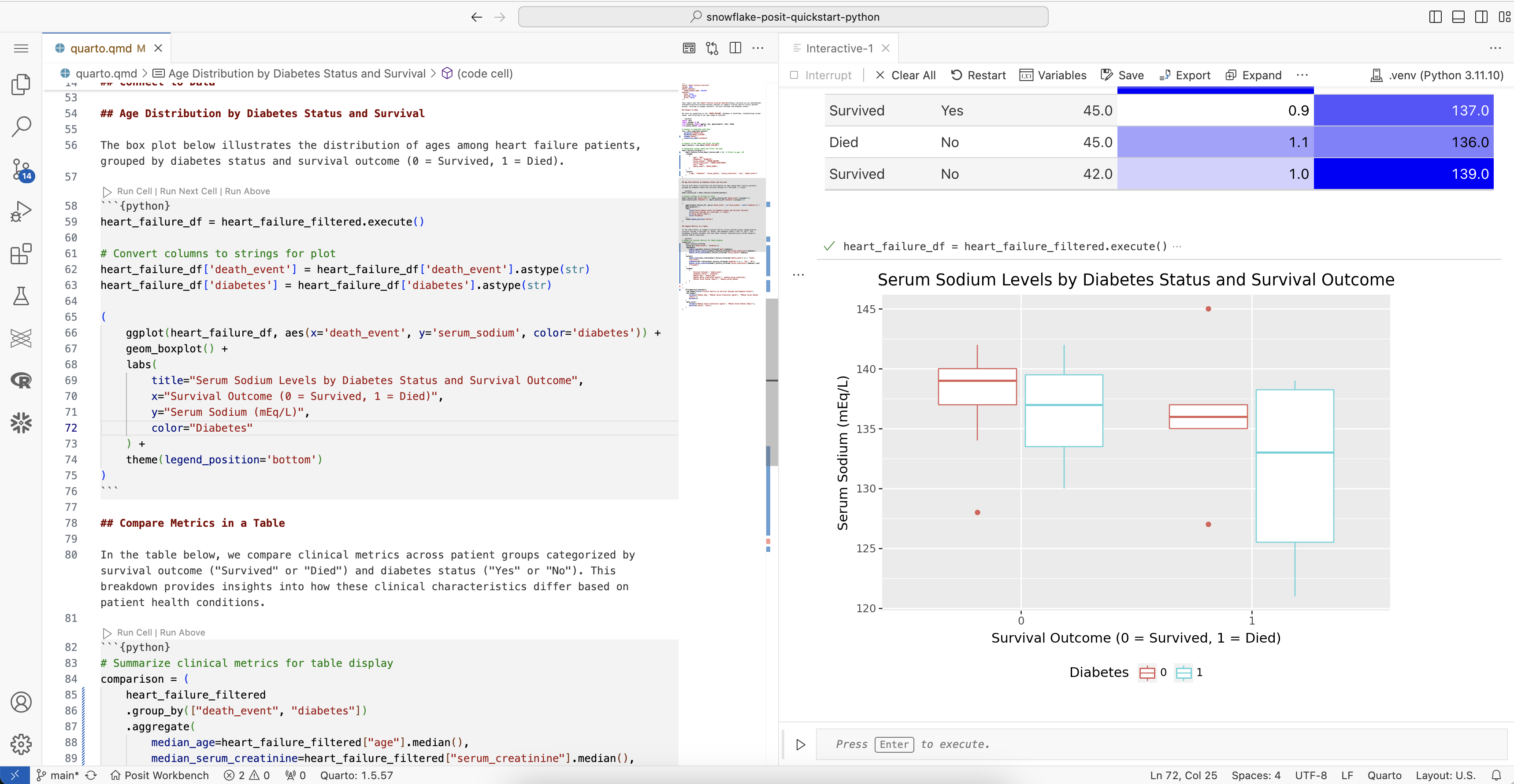
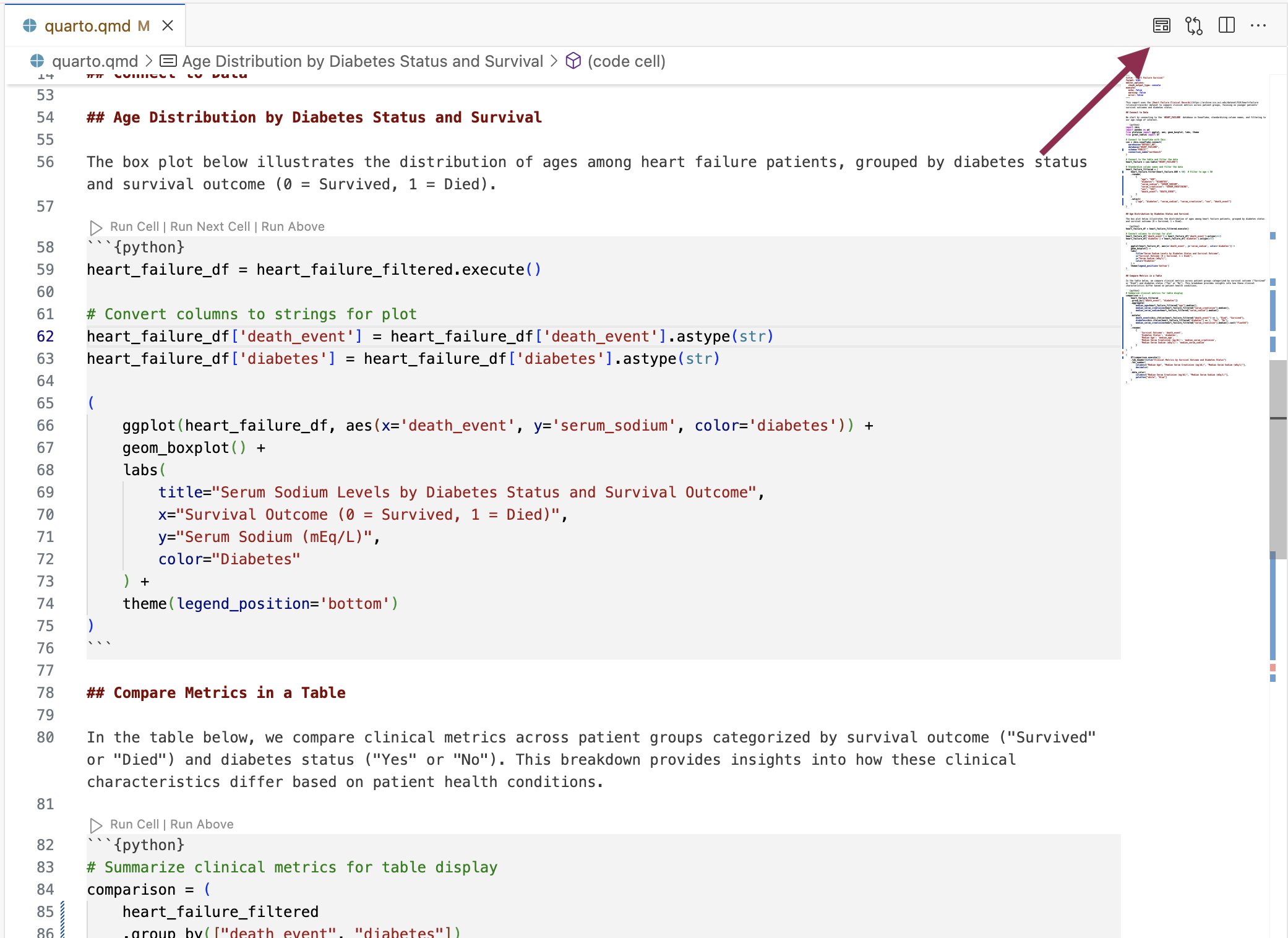
You can run any of the code chunks by clicking the Run Cell button above the chunk in VS Code.
When you run a cell, cell output is displayed in the Jupyter interactive console.
To render and preview the entire document, click the Preview button or run quarto preview quarto.qmd from the terminal.
This will run all the code in the document from top to bottom and generate an HTML file, by default, for you to view and share.
Learn More about Quarto
You can learn more about Quarto here: https://quarto.org/, and the documentation for all the various Quarto outputs here: https://quarto.org/docs/guide/. Quarto works with Python, R, and Javascript Observable code out-of-the box, and is a great tool to communicate your data science analyses.
Now, let's take a closer look at the code in our Quarto document. Our code will run in our Python environment, but will use data stored in our database on Snowflake.
To access this data, we'll use the Ibis library to connect to the database and query the data from Python, without having to write raw SQL. Let's take a look at how this works.
Connect to Database
Ibis is an open source dataframe library that works with a wide variety of backends, including Snowflake.
First, we import ibis, then use ibis.snowflake.connect to connect to the Snowflake database. We need to provide a warehouse for compute and a database to connect to. We can also provide a schema here to make connecting to specific tables easier.
import ibis

con = ibis.snowflake.connect(
  warehouse="HF_WH",
  database="HEART_FAILURE",
  schema="PUBLIC",
  connection_name="workbench"
)
The variable con now stores our connection.
Create a table
Once we build a connection, we can use table() to create an Ibis table expression that represents the database table.
heart_failure = con.table("HEART_FAILURE")
Translate Python to SQL
We can now use Ibis to interact with heart_failure. For example, we can filter rows and rename and select columns.
heart_failure_filtered = (
    heart_failure.filter(heart_failure.AGE < 50)
    .rename(
        {
            "age": "AGE",
            "diabetes": "DIABETES",
            "serum_sodium": "SERUM_SODIUM",
            "serum_creatinine": "SERUM_CREATININE",
            "sex": "SEX",
            "death_event": "DEATH_EVENT",
        }
    )
    .select(
        ["age", "diabetes", "serum_sodium", "serum_creatinine", "sex", "death_event"]
    )
)
Right now, heart_failure_filtered is still a table expression. Ibis lazily evaluates commands, which means that the full query is never run on the database unless explicitly requested.
Use .execute() or .to_pandas() to force Ibis to compile the table expression into SQL and run that SQL on Snowflake.
heart_failure_filtered.execute()
If we want to see the SQL code that Ibis generates, we can run ibis.to_sql().
ibis.to_sql(heart_failure_filtered)
SELECT
  "t0"."AGE" AS "age",
  "t0"."DIABETES" AS "diabetes",
  "t0"."SERUM_SODIUM" AS "serum_sodium",
  "t0"."SERUM_CREATININE" AS "serum_creatinine",
  "t0"."SEX" AS "sex",
  "t0"."DEATH_EVENT" AS "death_event"
FROM "HEART_FAILURE" AS "t0"
WHERE
  "t0"."AGE" < 50
Summary
This system:
- Keeps our data in the database, saving memory in the Python session.
- Pushes computations to the database, saving compute in the Python session.
- Evaluates queries lazily, saving compute in the database.
We don't need to manage the process, it happens automatically behind the scenes.
You can learn more about Ibis here. Take a look at the Snowflake backend documentation to learn more about using Ibis to interact with Snowflake specifically.
You can also use Ibis to create a new table in a database or append to an existing table.
To add a new table, use create_table().
con.create_table("HEART_FAILURE_FILTERED", heart_failure_filtered)
To insert data into an existing table, use insert().
Now that we understand how to interact with our database, we can use Python to perform our analysis.
We want to understand which variables in HEART_FAILURE are associated with survival of patients with heart failure.
First, we convert the column names to lowercase so we won't need to worry about capitalization.
heart_failure = heart_failure.rename(
    {
        "age": "AGE",
        "diabetes": "DIABETES",
        "serum_sodium": "SERUM_SODIUM",
        "serum_creatinine": "SERUM_CREATININE",
        "sex": "SEX",
        "death_event": "DEATH_EVENT",
    }
)
Filter ages
For now, we'll focus on patients younger than 50. We also reduce the data to just the columns we're interested in.
heart_failure_filtered = (
    heart_failure
    .filter(heart_failure.age < 50)  # Filter to age < 50
    .select(["age", "diabetes", "serum_sodium", "serum_creatinine", "sex", "death_event"])
)
The heart failure data provides important insights that can help us:
- Identify factors associated with increased risk of mortality after heart failure.
- Predict future survival outcomes based on historical clinical data.
- Benchmark patient outcomes based on clinical indicators like serum sodium levels.
Visualizing clinical variables across different patient groups can help identify patterns.
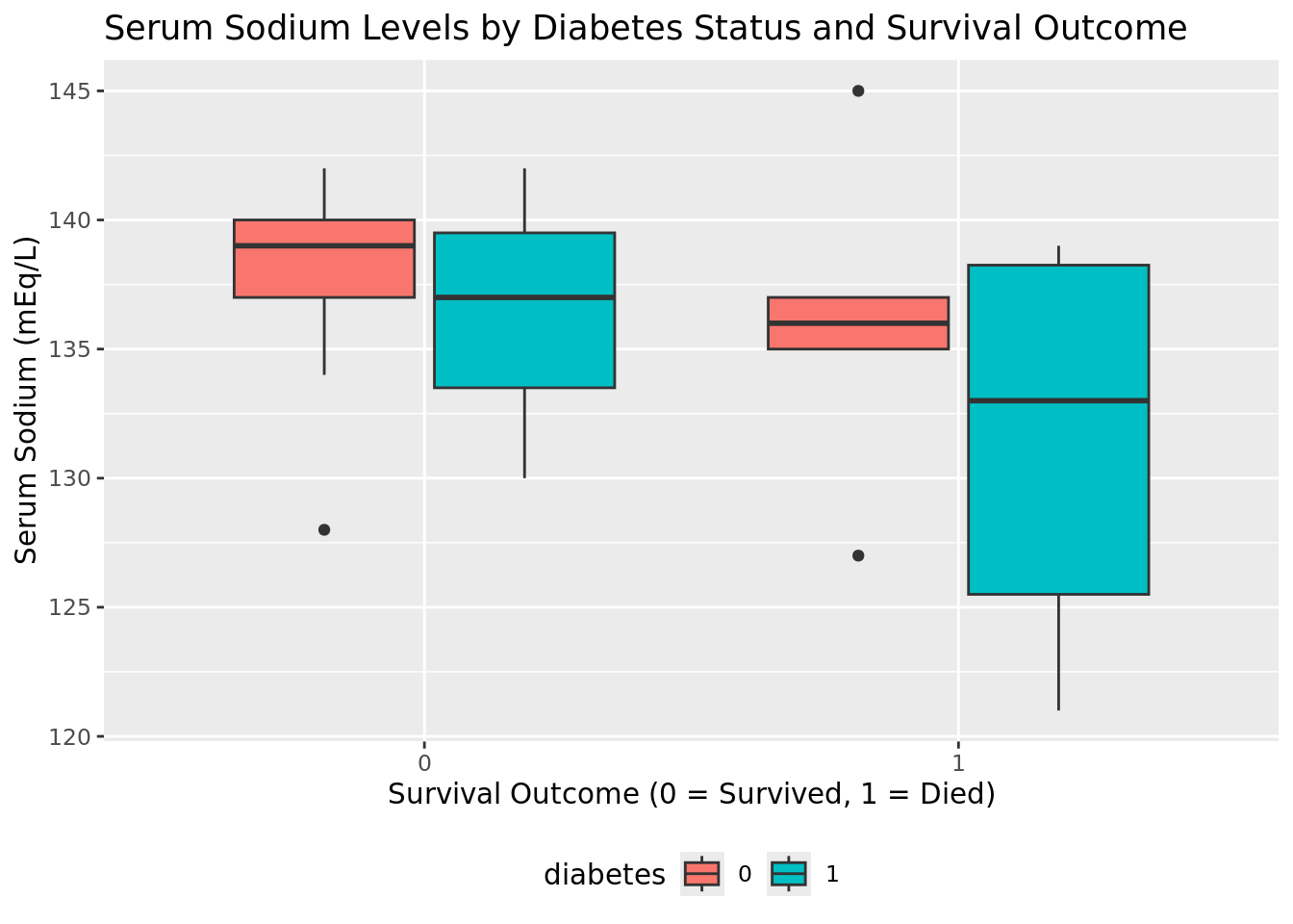
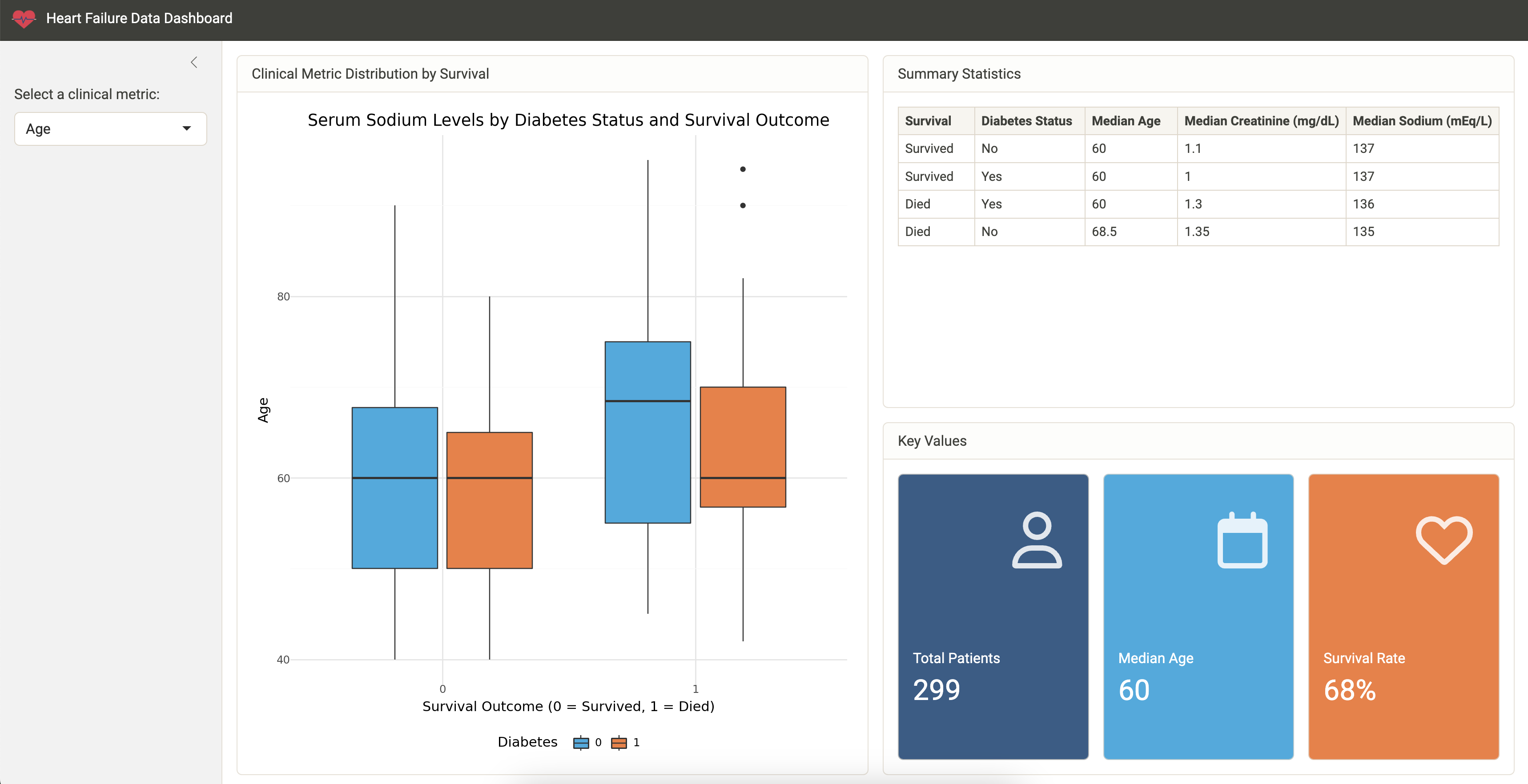
Visualize serum sodium levels
We can use plotnine to visually compare sodium levels across different patient groups. In this plot, we see the distribution of serum sodium based on whether the patients have diabetes and whether they survived (0) or died (1) during the follow-up period.
from plotnine import ggplot, aes, geom_boxplot, labs, theme

heart_failure_plot = (
    heart_failure_filtered
    .mutate(
        death_event=heart_failure_filtered["death_event"].cast("string"),
        diabetes=heart_failure_filtered["diabetes"].cast("string")
    )
)

(
    ggplot(heart_failure_plot, aes(x="death_event", y="serum_sodium", color="diabetes")) +
    geom_boxplot() +
    labs(
        title="Serum Sodium Levels by Diabetes Status and Survival Outcome",
        x="Survival Outcome (0 = Survived, 1 = Died)",
        y="Serum Sodium (mEq/L)",
        color="Diabetes"
    ) +
    theme(legend_position="bottom")
)
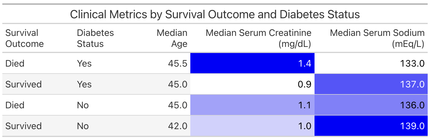
Next, we'll use Ibis to calculate the median values for various clinical metrics across different patient groups.
(
    heart_failure_filtered
    .group_by(["death_event", "diabetes"])
    .aggregate(
        median_age=heart_failure_filtered["age"].median(),
        median_serum_creatinine=heart_failure_filtered["serum_creatinine"].median(),
        median_serum_sodium=heart_failure_filtered["serum_sodium"].median()
    )
)
This is a useful way to examine the information for ourselves. However, if we wish to share the information with others, we might prefer to present the table in a more polished format. We can do this with the Great Tables package.
The following code prepares a table named comparison, which we'll display with Great Tables.
comparison = (
    heart_failure_filtered
    .group_by(["death_event", "diabetes"])
    .aggregate(
        median_age=heart_failure_filtered["age"].median(),
        median_serum_creatinine=heart_failure_filtered["serum_creatinine"].median(),
        median_serum_sodium=heart_failure_filtered["serum_sodium"].median()
    )
    .mutate(
        death_event=ibis.ifelse(heart_failure_filtered["death_event"] == 1, "Died", "Survived"),
        diabetes=ibis.ifelse(heart_failure_filtered["diabetes"] == 1, "Yes", "No"),
        median_serum_creatinine=heart_failure_filtered["serum_creatinine"].median().cast("float64")
    )
    .rename(
        {
            "Survival Outcome": "death_event",
            "Diabetes Status": "diabetes",
            "Median Age": "median_age",
            "Median Serum Creatinine (mg/dL)": "median_serum_creatinine",
            "Median Serum Sodium (mEq/L)": "median_serum_sodium"
        }
    )
)
Next, we use GT() and other Great Tables functions to create and style a table that displays comparison. Note that we need to evaluate comparison with .execute() first because GT() only accepts Pandas or Polars DataFrames.
from great_tables import GT

(
    GT(comparison.execute())
    .tab_header(title="Clinical Metrics by Survival Outcome and Diabetes Status")
    .fmt_number(
        columns=["Median Age", "Median Serum Creatinine (mg/dL)", "Median Serum Sodium (mEq/L)"],
        decimals=1
    )
    .data_color(
        columns=["Median Serum Creatinine (mg/dL)", "Median Serum Sodium (mEq/L)"],
        palette=["white", "blue"]
    )
)
Earlier, we showed you how to render a report from our Quarto document. Another way to share our work and allow others to explore the heart failure dataset is to create an interactive Shiny app.
Our GitHub repository contains an example Shiny app. This app allows the user to explore different clinical metrics in one place.
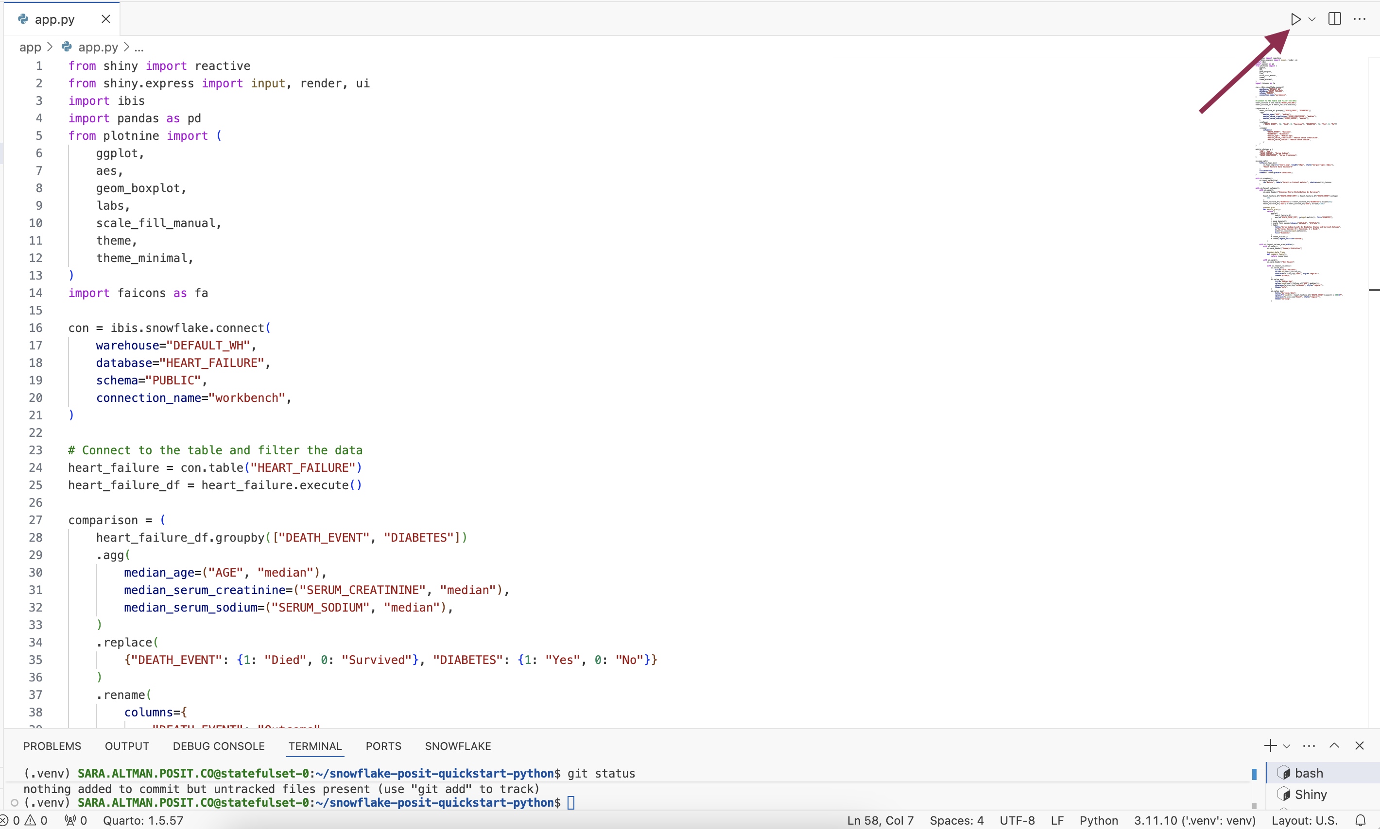
To run the app, open app/app.py and then click the Run Shiny App button at the top of the script in VS Code.
After launching the app, use the sidebar to change the metric displayed.
Learn More About Shiny
You can learn more about Shiny at: https://shiny.posit.co/.
If you're new to Shiny, you can try it online with shinylive. Shinylive is also available for R for Shiny for R.
Overview
Python is a powerful, versatile tool for data science, and combined with Snowflake's high-performance data capabilities, it enables robust, end-to-end data workflows. Using the Posit Workbench Native Application, you can securely work with Python within Snowflake while taking advantage of tools like Ibis, Quarto, and Shiny for Python to analyze, visualize, and share your results.
What You Learned
- How to use VS Code within the Posit Workbench Native App.
- How to connect to your Snowflake data from Python to create tables, visualizations, and more.
- How to create a Quarto document containing plots and tables built in Python, using data stored in Snowflake.
- How to build an interactive Shiny for Python application, working with data stored in Snowflake.
Resources
- Source Code on GitHub
- More about Posit Workbench
- Ibis library website
- plotnine package for plotting with a grammar of graphics in Python
- Great Tables package for publication-ready tables in Python
- Quarto for reproducible documents, reports, and data products
- Shiny for interactive dashboards and applications
- Run Shiny entirely in the browser with shinylive